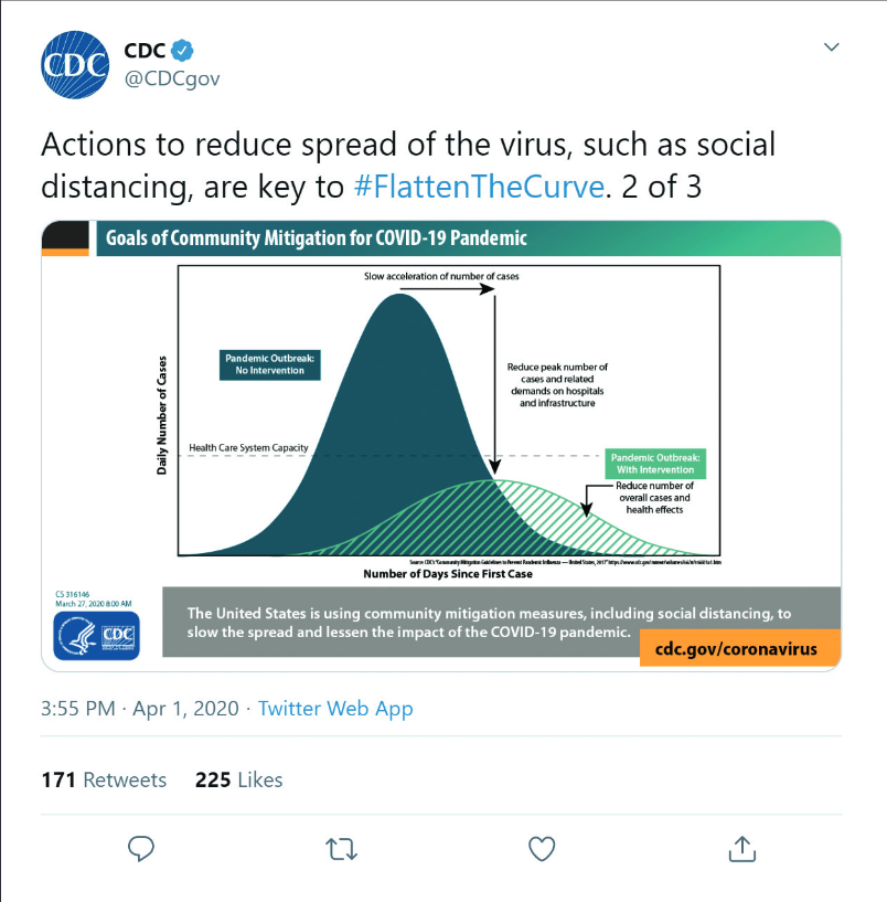
As technology improved into the 21st century, so did modern designs; now, infographics contain layered content, clearer hierarchy and more deliberate use of evidence, icons, color and layout. One recent example is the "flatten the curve" infographic, which became a defining visual of the COVID-19 pandemic response (Figure 2).4 During the COVID-19 pandemic, healthcare professionals created and distributed infographics addressing vaccine hesitancy and misinformation, reaching tens of thousands of people through social media platforms.5
Figure 2. CDC post on Twitter (now X) depicting public health messaging during the COVID-19 pandemic.4
Why Infographics Continue to Work for Continuing Education
The case for infographics in CE begins with how human memory works. People are more likely to recall information when it is presented as both images and words.8 This is dual coding theory at work. A well-designed infographic with minimal text and reinforcing images allows readers to absorb disease characteristics, diagnostic algorithms or treatment regimens at a glance. These quick overviews can scaffold learning and help build mental frameworks.9
Surveys of medical professionals consistently point out multiple benefits of infographics for sharing research.10 In one survey of 254 users — two-thirds of whom were health professionals — 92% reported using infographics to communicate research, 64% viewed infographics as tools to reduce the time burden of reading full texts and 41% used them as a substitute for reading the full-text article at least half the time.11 These numbers are telling. Infographics have moved past being a tool for engagement and now reflect best practices in multimedia learning, microlearning and timely education delivery.
Underneath all of this is a broader shift in how knowledge is communicated. Visual communication is becoming a core competency, and many degree programs are increasingly incorporating visual literacy into their curricula. For CE developers, this means that audiences are approaching CE activities with growing familiarity and an expectation for visual content, raising the bar for quality.
Accreditation Requirements for CE Infographics
CME/CE guidance recommends prioritizing coherence, signaling and redundancy so that summary images help health care professionals encode a schema and then layer in the details.9 However, neither the ACCME nor the ACPE detail specific standards for infographics.
That is the point. The standards of accuracy, balance and independence are format-neutral, so any accredited activity must be built on a documented practice gap, kept independent of commercial influence and evaluated along the chain from knowledge to competence to performance. The challenge — and responsibility — for CE professionals is transferring those standards to infographic development and understanding which design characteristics optimize impact for different audiences and types of knowledge.
CE professionals should be cautioned that a visually engaging infographic that fails to meet these standards becomes a liability. A practical approach is to treat infographics like any other accredited educational program. This means building them with a documented planning process, applying a structured content and development workflow from the start, and framing it as one output of the needs assessment and gap analysis.
A few practices can make this easier to maintain in the development of an infographic:
- Build an evidence table.
 Create a simple table or rubric that pairs each heading, claim or visual element with its data source. This rubric lets reviewers quickly verify that each element is supported and applied appropriately. It also creates a documented record of the review process.
- Make bias mitigation visible in the design itself.
 Callouts and badges such as “first line” or “preferred” should be aligned with guideline language or strong evidence. Those labels may be set apart visually and should be attributed directly to the source. This keeps the evidence-based information transparent.
- Cite sources efficiently.
 Space is limited on infographics, but citations cannot be cut. Concise citations or a QR code linking to a full reference list or the complete CE activity preserve the design and scientific rigor.
- Connect infographics to outcomes.
 Each infographic should be connected to a specific knowledge, competence or performance metric. Capturing learner feedback on clarity and utility after delivery also supports continuous quality improvement.
The Road Ahead for Infographics
What began 50 years ago as a tool for public health communication has evolved into a more targeted form of visual education. On a single page, deciding what earns a place and what gets cut is the whole job, and the language is its own balancing act: a figure summarizing device-use data, a set of counseling tips a pharmacist can share with a patient, and a synopsis of a guideline update each call for a different voice and a different level of detail. Infographics now serve as stand-alone tools that support interpretation, recall, and decision-making in professional education Choosing what matters most for a specific learner and a specific gap is what separates an infographic that merely circulates from one that teaches—and it's why infographics are becoming recognized as standalone deliverables and supporting resources that extend the main educational content.
This is a conversation the Almanac has been having for years. A 2017 piece laid out a practical, cognitive-load-based process for crafting dense data into something a clinician can absorb.12 By 2020, the conversation had moved to what that craft could achieve. The Cardiometabolic Health Congress showed that a 9-part interactive infographic resulted in measurable gains in knowledge and competence, with competence in diagnosing and treating these patients rose from 53% to 75% pre- to post-activity, and 9 in 10 learners reported planning a practice change.13 Shortly after, an Alliance collaboration used an infographic not just to teach but to report, distilling a pneumococcal vaccination quality-improvement project into a single shareable visual.14 More recently, recent work on flexible, microlearning places infographics among the formats that meet clinicians in the flow of work.15 Together, the commentary weaves a picture that explores beyond whether infographics belong in CE to how to design them well—and this article is one more step along that path.
The next several years will likely bring new opportunities and new responsibilities. Artificial intelligence is already lowering the barrier to visual content creation, and interactive, mobile-optimized infographics are poised to become more common. As visual literacy becomes an expected professional competency, the ease of creation will raise the stakes and place greater pressure on CE developers to remain attentive to accuracy, balance, and independence. If the past 50 years taught us how to make infographics work for CE, the next 50 years will test whether CE professionals can scale that work without compromising the standards that make it trustworthy.
Disclosure: Icons included in this article were created with the assistance of AI technology (Gemini 3).
References
- Costa A, Bakker J, Plucinska G. How and why it works: The principles and history behind visual communication. Medical Writing. 2020;29(1). https://journal.emwa.org/visual-communications/how-and-why-it-works-the-principles-and-history-behind-visual-communication/
- Medcalf A, Nunes J. Visualising Primary Health Care: World Health Organization Representations of Community Health Workers, 1970–89. Med Hist. 2018;62(4):401-424. doi: 10.1017/mdh.2018.40
- NHLBI 75th Anniversary Digital Timeline. National Heart, Lung, and Blood Institute. Accessed June 24, 2026. https://www.nhlbi.nih.gov/75years/timeline
- Valencia S, Kirabo L. Twitter, COVID-19, and disability: what worked and what didn’t. XRDS. 2021;28(2):20-23. doi:10.1145/3495255
- Rotolo SM, Jain S, Dhaon S et al. A coordinated strategy to develop and distribute infographics addressing COVID-19 vaccine hesitancy and misinformation. J Am Pharm Assoc (2003). 2022;62(1):224-231. doi: 10.1016/j.japh.2021.08.016
- Van Bostraeten P, Aertgeerts B, Bekkering GE et al. Infographic summaries for clinical practice guidelines: results from user testing of the BMJ Rapid Recommendations in primary care. BMJ Open. 2023;13(11):e071847. doi: 10.1136/bmjopen-2023-071847
- BMJ Rapid Recommendations. Accessed June 29, 2026. https://www.bmj.com/rapid-recommendations
- Ensor TM, Bancroft TD, Hockley WE. Listening to the Picture-Superiority Effect. Exp Psychol. 2019;66(2):134-153. doi: 10.1027/1618-3169/a000437
- Spicer JO, Coleman CG. Creating Effective Infographics and Visual Abstracts to Disseminate Research and Facilitate Medical Education on Social Media. Clin Infect Dis. 2022;74(suppl 3):e14-322. doi: 10.1093/cid/ciac058
- Butdisuwan S, Annamma LM, Subaveerapandiyan A, George BT, Kataria S. Visualising Medical Research: Exploring the Influence of Infographics on Professional Dissemination. ScientificWorldJournal. 2024:5422121. doi: 10.1155/2024/5422121
- Zadro JR, Ferreira GE, O’Keeffe M, Stahl-Timmins W, Elkins MR, Maher CG. How do people use and view infographics that summarise health and medical research? A cross-sectional survey. BMC Med Educ. 2022;22(1):677. doi: 10.1186/s12909-022-03744-6
- Shah B, Roy K. Better ways to present information and data. The Almanac. July 1, 2017. Accessed July 13, 2026. https://almanac.acehp.org/Outcomes/Outcomes-Article/better-ways-to-present-information-and-data
- Jamrogiewicz A, Karandrea S, Agarwal N; Cardiometabolic Health Congress. Constellation of COPD and cardiometabolic conditions addressed with interactive CME. The Almanac. September 14, 2020. Accessed July 13, 2026. https://almanac.acehp.org/Outcomes/Outcomes-Article/constellation-of-copd
- Infographic: Pneumococcal vaccination quality improvement outcomes. The Almanac. December 8, 2022. Accessed July 13, 2026. https://almanac.acehp.org/Outcomes/Outcomes-Article/infographic-pneumococcal-vaccination-quality-improvement-outcomes
- Radhakrishnan V, Keenan C, Cribari-Starr S, Moore M, Ngu G. Flexible learning for busy clinicians: strategies for effective CE/CME. The Almanac. March 4, 2026. Accessed July 13, 2026. https://almanac.acehp.org/Education/Education-Article/flexible-learning-for-busy-clinicians-strategies-for-effective-cecme
Interested in this article? Join the discussion in the Alliance Community.